Thursday, May 20, 2010

Seattle's Best Coffee - New Logo Design

From this article by Joe Lynch of Yahoo's Personal Section, came out the old and the new logo design of Seattle's Best Coffee.


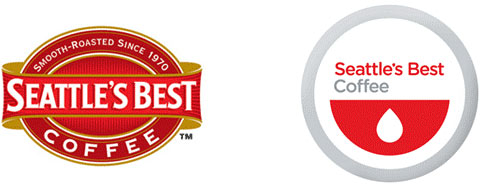
Comments said that the new logo looks like a bowl with tears, or a logo of a blood donor center. But for me, first time I saw it. I thought of a canned soda's top view. The Coca Cola soda in particular.


Friday, January 1, 2010

Fitszu Who?

The company behind this lovely match. I thought this is too much work for a match because matches cannot be expensive (and this one costs $48) and well, they'll just burn away. But hey, look at that beauty.


So Happy New Year, boys and girls! Be careful lighting up that firecracker with this match.